Diamonds 데이터셋을 이용하여 matplotlib, seaborn, plotly package 내 함수를 이용하여 Diamonds 내 주요 정보 도출하가 위하여 다음의 그래프를 시각화하고 insight를 도출하 시오.
◼ Dataset: -----------------------------------
import seaborn as sns df = sns.load_dataset('diamonds') df
-----------------------------------
◼ Graph: scatter plot, barplot, barhplot, line chart, areaplot, histogram, pie chart, box plot, 3D graph, lmplot, countplot, heatmap, joint plot, kdeplot, pairplot, replot, rugplot, violinplot, interactive plot
import seaborn as sns
import matplotlib
import matplotlib.pyplot as plt
import pandas as pd
import plotly.express as px
import numpy as np
import os
import matplotlib.ticker as mticker
import platform
from pandas.api.types import CategoricalDtype

system_name = platform.system()
if system_name == 'Windows':
    font_family = 'Malgun Gothic'

plt.rc('font', family=font_family)
plt.rc('axes', unicode_minus=False)

folder_name = '시각화'
if not os.path.exists(folder_name):
    os.makedirs(folder_name)


df = sns.load_dataset('diamonds')

df.rename(columns={'color': '색상'}, inplace=True)

new_color_names = {
    'D': 'D (최상급 무색)',
    'E': 'E (무색)',
    'F': 'F (미세 무색)',
    'G': 'G (거의 무색)',
    'H': 'H (아주 옅은 노란색)',
    'I': 'I (옅은 노란색)',
    'J': 'J (노란색)'
}
df['색상'] = df['색상'].cat.rename_categories(new_color_names)

# 3. 카테고리 순서 재정렬 (D가 가장 좋은 등급이므로 그 순서대로)
color_order = ['D (최상급 무색)', 'E (무색)', 'F (미세 무색)', 'G (거의 무색)', 'H (아주 옅은 노란색)', 'I (옅은 노란색)', 'J (노란색)']
df['색상'] = df['색상'].cat.reorder_categories(color_order, ordered=True)

df.rename(columns={'cut': '컷팅'}, inplace=True)

new_category_names = { 'Ideal': '훌륭함', 'Premium': '매우 좋음', 'Very Good': '좋음', 'Good': '보통', 'Fair': '미흡' }
df['컷팅'] = df['컷팅'].cat.rename_categories(new_category_names)

cut_order = ['미흡', '보통', '좋음', '매우 좋음', '훌륭함']
df['컷팅'] = df['컷팅'].cat.reorder_categories(cut_order, ordered=True)


palette_deep = sns.color_palette('deep', 5)
palette_deep_dict = dict(zip(cut_order, px.colors.qualitative.Plotly[:5]))


# 1. Scatter Plot (산점도)
plt.figure(figsize=(10, 6))
sns.scatterplot(data=df, x='carat', y='price', hue='컷팅', palette=palette_deep, alpha=0.5, hue_order=cut_order)
plt.title('캐럿과 가격의 관계 (cut 등급 별)', fontsize=20)
plt.xlabel('캐럿 (Carat)', fontsize=15)
plt.ylabel('가격 (Price)', fontsize=15)
plt.xlim(0, 3)
plt.ylim(0, 15000)
plt.savefig(os.path.join(folder_name, '1_scatter_plot.png'))
plt.show(block=True)

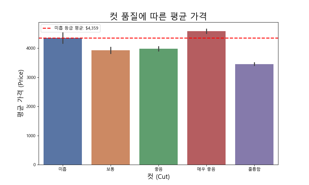
# 2. Bar Plot (막대 그래프)
mean = df[df['컷팅'] == '미흡']['price'].mean()
plt.figure(figsize=(10, 6))
ax = sns.barplot(x='컷팅', y='price', data=df, palette=palette_deep, order=cut_order)
plt.title('컷 품질에 따른 평균 가격', fontsize=20)
plt.xlabel('컷 (Cut)', fontsize=15)
plt.ylabel('평균 가격 (Price)', fontsize=15)
ax.axhline(y=mean, color='red', linestyle='--', linewidth=2, label=f'미흡 등급 평균: ${mean:,.0f}')
ax.legend()
plt.savefig(os.path.join(folder_name, '2_bar_plot.png'))
plt.show(block=True)

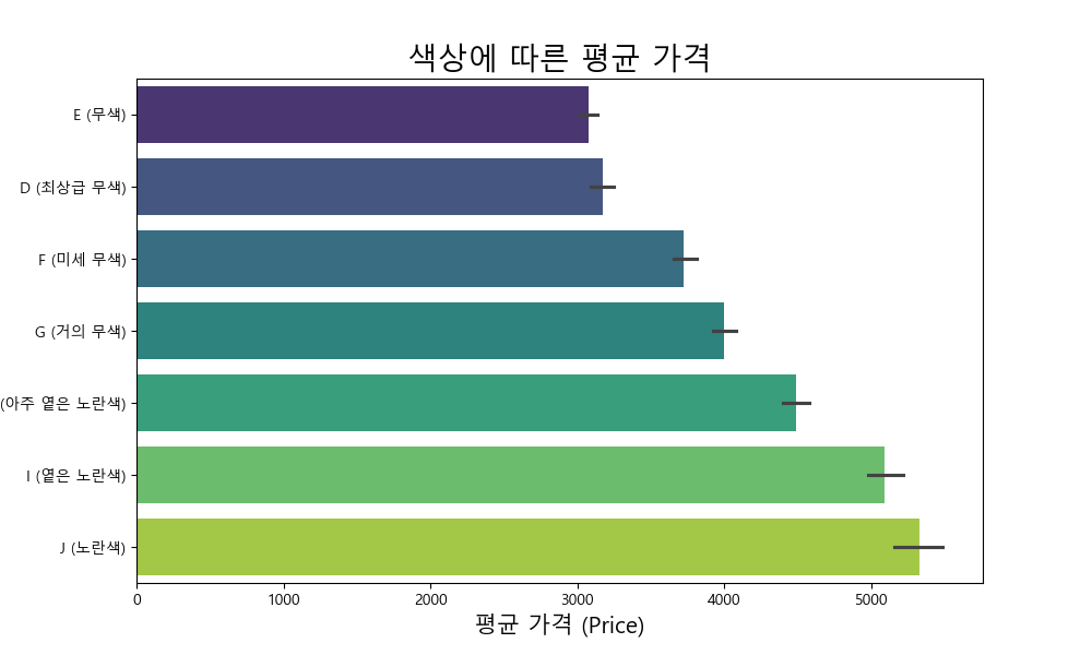
# 3. Horizontal Bar Plot (수평 막대 그래프)
plt.figure(figsize=(10, 6))
color_order_y = df.groupby('색상')['price'].mean().sort_values().index
sns.barplot(x='price', y='색상', data=df, orient='h', order=color_order_y, palette='viridis')
plt.title('색상에 따른 평균 가격', fontsize=20)
plt.xlabel('평균 가격 (Price)', fontsize=15)
plt.ylabel('색상 (Color)', fontsize=15)
plt.savefig(os.path.join(folder_name, '3_barh_plot.png'))
plt.show(block=True)


# Seaborn 스타일 설정 (이후 모든 그래프에 적용)
sns.set(style='whitegrid', context='talk', font=font_family, rc={'axes.unicode_minus': False})

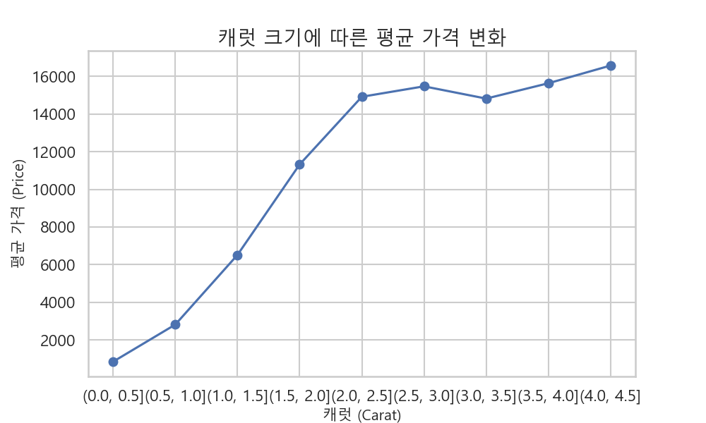
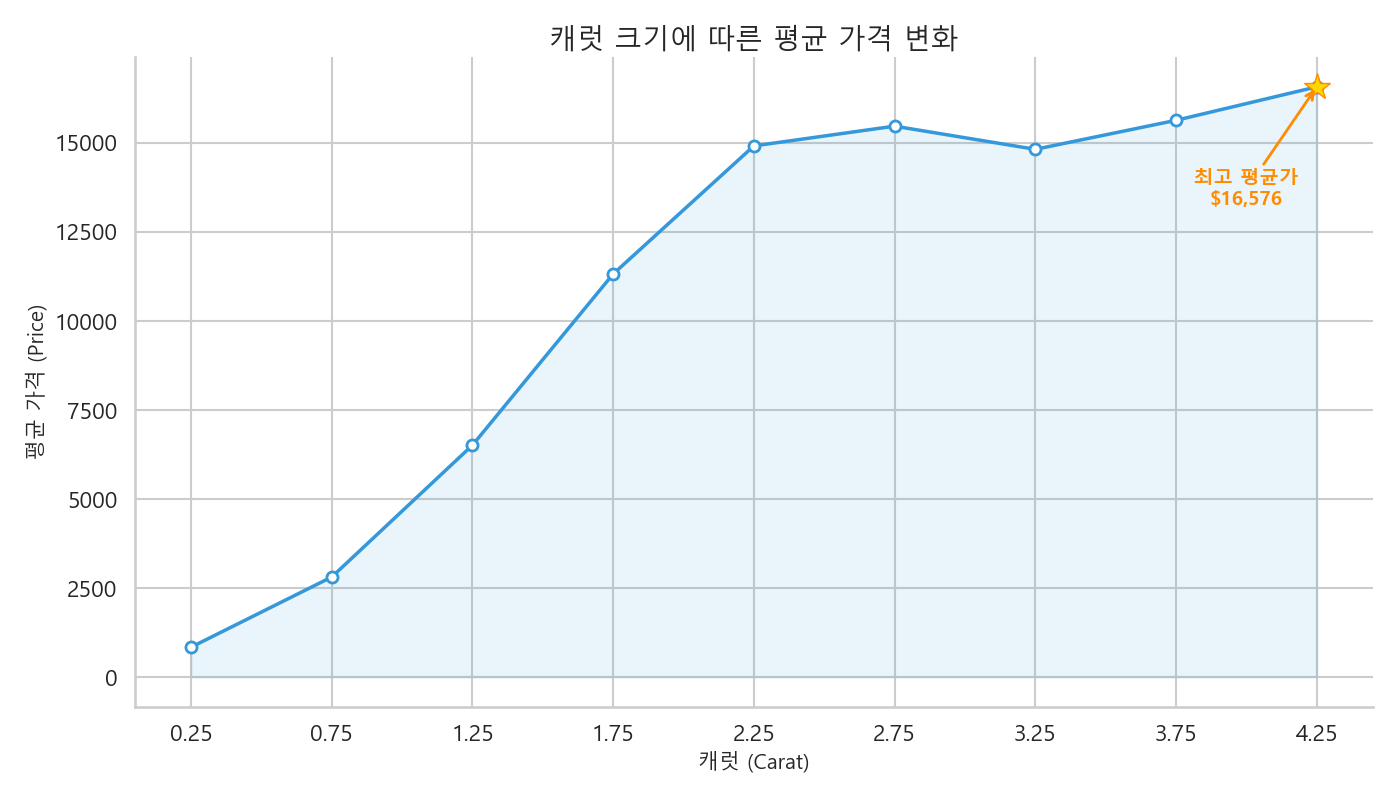
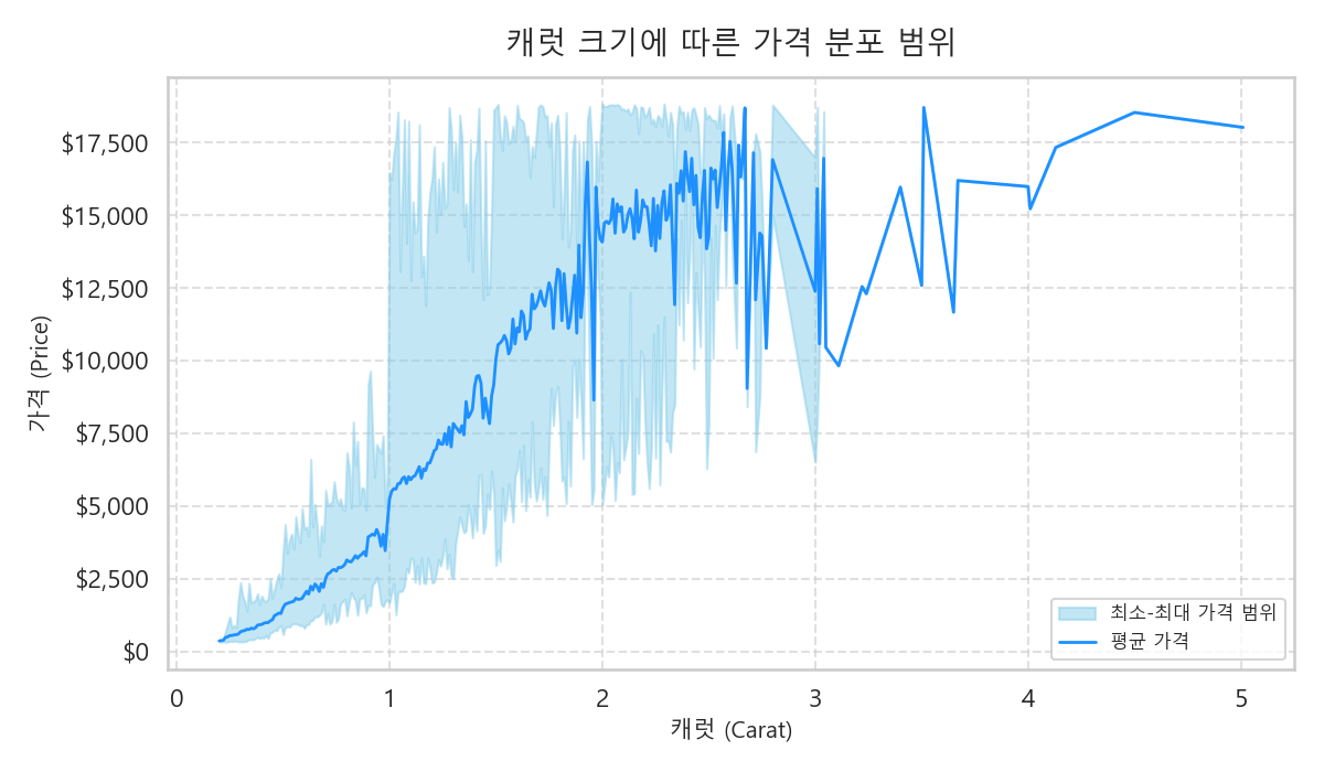
# 4-1. Line Chart (선 그래프)
price_by_carat = df.groupby(pd.cut(df['carat'], bins=np.arange(0, 5.5, 0.5)))['price'].mean()
plt.figure(figsize=(14, 8))
ax = price_by_carat.plot(kind='line', marker='o', ms=8, lw=2.5, color='#3498db', markerfacecolor='white', markeredgecolor='#3498db', markeredgewidth=2)
x_data, y_data = np.arange(len(price_by_carat)), price_by_carat.values
ax.fill_between(x_data, y_data, color='#3498db', alpha=0.1)
ax.set_xticks(range(len(price_by_carat)))
ax.set_xticklabels([f'{interval.mid:.2f}' for interval in price_by_carat.index])
y_max, x_max_idx = price_by_carat.max(), price_by_carat.idxmax()
x_max_pos = price_by_carat.index.get_loc(x_max_idx)
ax.plot(x_max_pos, y_max, marker='*', ms=20, color='gold', markeredgecolor='darkorange', zorder=3)
ax.annotate(f'최고 평균가\n${y_max:,.0f}', xy=(x_max_pos, y_max), xytext=(x_max_pos - 0.5, y_max * 0.8), fontsize=14, fontweight='bold', color='darkorange', arrowprops=dict(arrowstyle="->", color='darkorange', lw=2), ha='center')
plt.title('캐럿 크기에 따른 평균 가격 변화', fontsize=20)
plt.xlabel('캐럿 (Carat)', fontsize=15)
plt.ylabel('평균 가격 (Price)', fontsize=15)
sns.despine()
plt.tight_layout()
plt.savefig(os.path.join(folder_name, '4_line_chart_improved.png'))
plt.show(block=True)

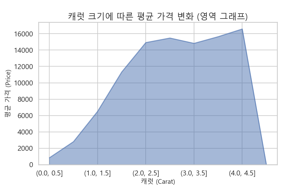
# 5. Area Plot (영역 그래프)
plt.figure(figsize=(10, 6))
price_by_carat.plot(kind='area', alpha=0.5)
plt.title('캐럿 크기에 따른 평균 가격 변화 (영역 그래프)', fontsize=20)
plt.xlabel('캐럿 (Carat)', fontsize=15)
plt.ylabel('평균 가격 (Price)', fontsize=15)
plt.savefig(os.path.join(folder_name, '5_area_plot.png'))
plt.show(block=True)


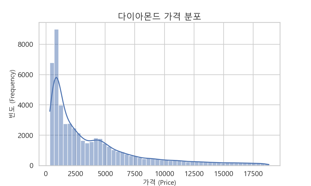
# 6. Histogram (히스토그램)
plt.figure(figsize=(10, 6))
sns.histplot(df['price'], bins=50, kde=True)
plt.title('다이아몬드 가격 분포', fontsize=20)
plt.xlabel('가격 (Price)', fontsize=15)
plt.ylabel('빈도 (Frequency)', fontsize=15)
plt.savefig(os.path.join(folder_name, '6_histogram.png'))
plt.show(block=True)

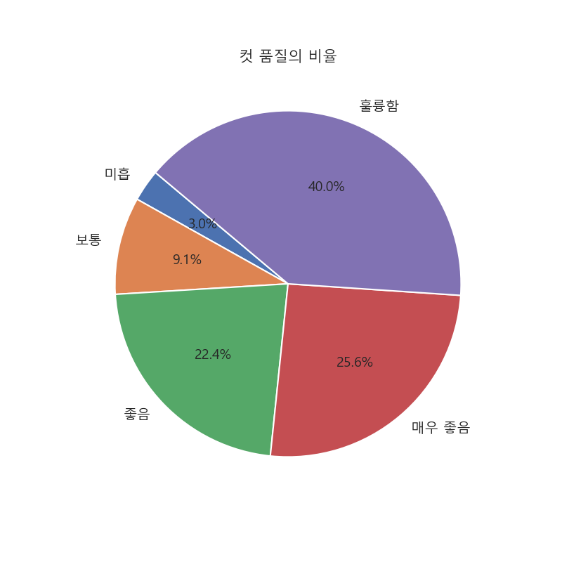
# 7. Pie Chart (파이 차트)
cut_counts = df['컷팅'].value_counts().sort_index()
plt.figure(figsize=(8, 8))
plt.pie(cut_counts, labels=cut_counts.index, autopct='%1.1f%%', startangle=140, colors=palette_deep, textprops={'fontsize': 14})
plt.title('컷 품질의 비율', fontsize=15)
plt.ylabel('')
plt.savefig(os.path.join(folder_name, '7_pie_chart.png'))
plt.show(block=True)

# 8. Box Plot (박스 플롯)
plt.figure(figsize=(10, 6))
sns.boxplot(x='컷팅', y='price', data=df, palette=palette_deep, order=cut_order)
plt.title('컷 품질에 따른 가격 분포', fontsize=20)
plt.xlabel('컷 (Cut)', fontsize=15)
plt.ylabel('가격 (Price)', fontsize=15)
plt.savefig(os.path.join(folder_name, '8_box_plot.png'))
plt.show(block=True)


# 9. 3D Graph (3D 그래프) - Plotly
fig = px.scatter_3d(df.sample(2000, random_state=42), x='carat', y='price', z='depth', color='컷팅', title='캐럿, 가격, 깊이의 3D 관계', color_discrete_map=palette_deep_dict)
fig.write_html(os.path.join(folder_name, "9_3d_scatter_plot.html"))

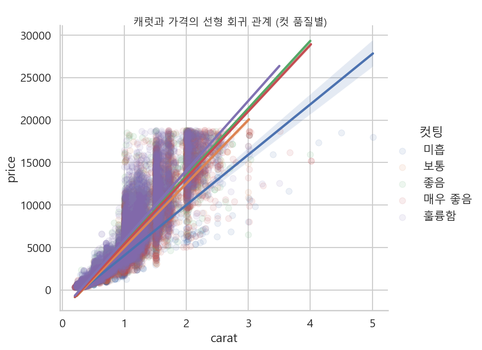
# 10. lmplot (회귀선 플롯)
lm = sns.lmplot(x='carat', y='price', hue='컷팅', data=df, height=7, aspect=1.2, scatter_kws={'alpha':0.1},
                hue_order=cut_order, palette=palette_deep)
lm.fig.suptitle('\n캐럿과 가격의 선형 회귀 관계 (컷 품질별)', y=1.02, fontsize=15)
plt.savefig(os.path.join(folder_name, '10_lmplot.png'), bbox_inches='tight')
plt.show(block=True)

# 11. Count Plot (개수 플롯)
plt.figure(figsize=(10, 6))
sns.countplot(x='컷팅', data=df, order=cut_order, palette=palette_deep)
plt.title('컷 품질별 다이아몬드 개수', fontsize=20)
plt.xlabel('컷 (Cut)', fontsize=15)
plt.ylabel('개수 (Count)', fontsize=15)
plt.savefig(os.path.join(folder_name, '11_countplot.png'))
plt.show(block=True)


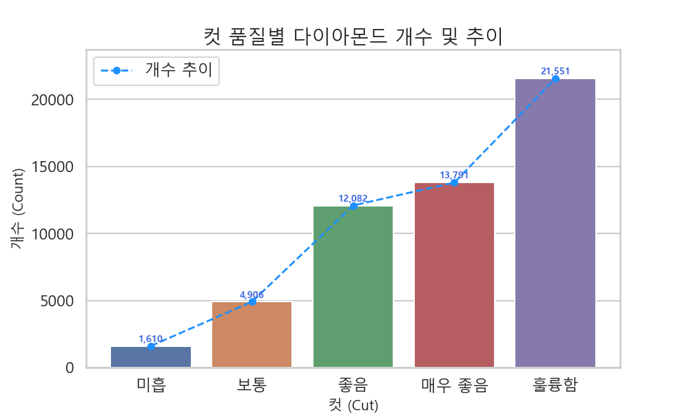
plt.figure(figsize=(10, 6))
ax = sns.countplot(x='컷팅', data=df, order=cut_order, palette=palette_deep)
counts = df['컷팅'].value_counts().reindex(cut_order)
ax.plot(range(len(counts)), counts.values, color='dodgerblue',
        marker='o', ms=7, linestyle='--', linewidth=2, # ms는 마커 사이즈
        label='개수 추이')
for i, count in enumerate(counts):
    ax.text(i, # x 위치 (0, 1, 2, 3, 4)
            count + 300, # y 위치 (막대 상단에서 약간 위)
            f'{count:,}', # 표시할 텍스트 (천 단위 쉼표 포맷)
            ha='center', # 수평 정렬
            fontsize=10,
            color='royalblue',
            fontweight='bold')
ax.legend()
plt.title('컷 품질별 다이아몬드 개수 및 추이', fontsize=20)
plt.xlabel('컷 (Cut)', fontsize=15)
plt.ylabel('개수 (Count)', fontsize=15)
plt.ylim(0, counts.max() * 1.1)
plt.savefig(os.path.join(folder_name, '11_countplot_with_values.png'))
plt.show(block=True)


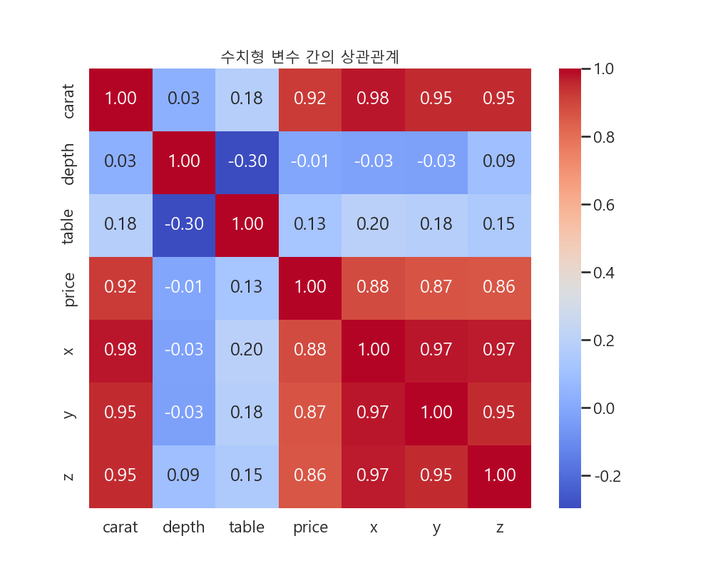
# 12. Heatmap (히트맵)
numerical_df = df.select_dtypes(include=np.number)
correlation_matrix = numerical_df.corr()
plt.figure(figsize=(10, 8))
sns.heatmap(correlation_matrix, annot=True, cmap='coolwarm', fmt='.2f')
plt.title('수치형 변수 간의 상관관계', fontsize=15)
plt.savefig(os.path.join(folder_name, '12_heatmap.png'))
plt.show(block=True)

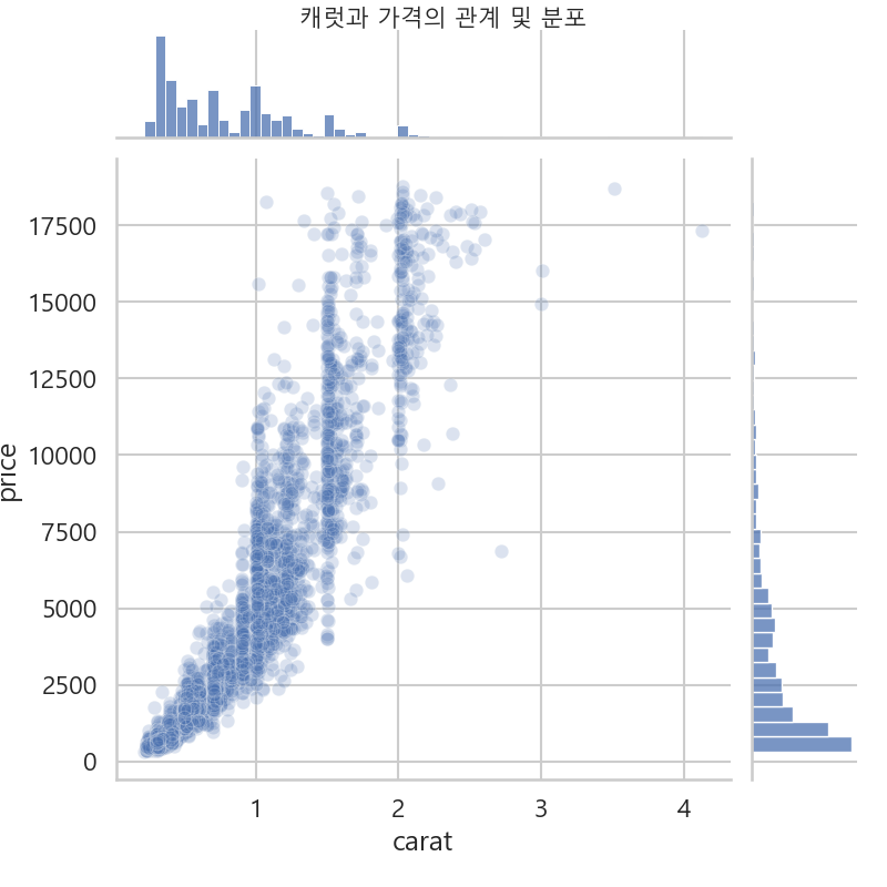
# 13. Joint Plot (조인트 플롯)
jp = sns.jointplot(x='carat', y='price', data=df.sample(5000, random_state=100), kind='scatter', height=8, joint_kws={'alpha':0.2})
jp.fig.suptitle('\n캐럿과 가격의 관계 및 분포', y=1.02, fontsize=15)
plt.savefig(os.path.join(folder_name, '13_joint_plot.png'))
plt.show(block=True)

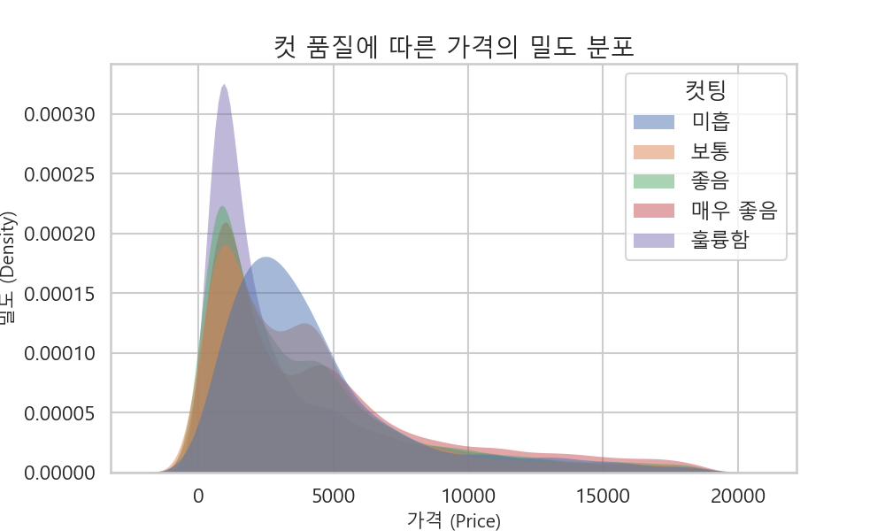
# 14. KDE Plot (커널 밀도 추정 플롯)
plt.figure(figsize=(10, 6))
sns.kdeplot(data=df, x='price', hue='컷팅', fill=True, common_norm=False, palette=palette_deep, hue_order=cut_order, alpha=.5, linewidth=0)
plt.title('컷 품질에 따른 가격의 밀도 분포', fontsize=20)
plt.xlabel('가격 (Price)', fontsize=15)
plt.ylabel('밀도 (Density)', fontsize=15)
plt.savefig(os.path.join(folder_name, '14_kdeplot.png'))
plt.show(block=True)

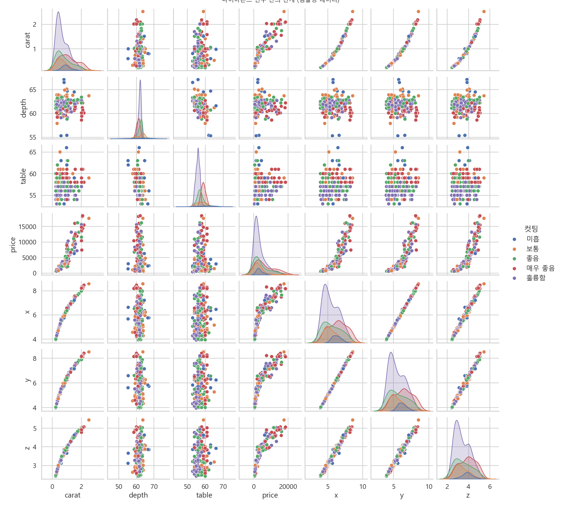
# 15. Pair Plot (페어 플롯)
sampled_df = df.sample(n=200, random_state=42)
pp = sns.pairplot(sampled_df, hue='컷팅', hue_order=cut_order, palette=palette_deep)
pp.fig.suptitle('\n다이아몬드 변수 간의 관계 (샘플링 데이터)', y=1.02, fontsize=15)
plt.savefig(os.path.join(folder_name, '15_pairplot.png'))
plt.show(block=True)

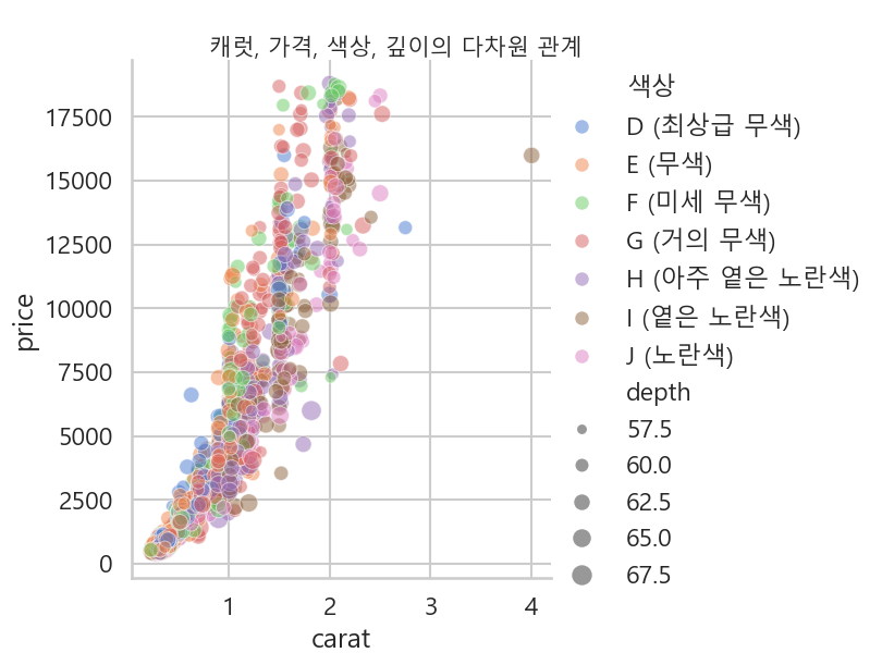
# 16. Relational Plot (replot)
rp = sns.relplot(x='carat', y='price', hue='색상', size='depth',
            sizes=(10, 200), alpha=.5, palette="muted",
            height=6, data=df.sample(2000, random_state=42))
rp.fig.suptitle('\n캐럿, 가격, 색상, 깊이의 다차원 관계', y=1.03, fontsize=15)
plt.savefig(os.path.join(folder_name, '16_relplot.png'), bbox_inches='tight')
plt.show(block=True)

# 17. Rug Plot (러그 플롯)
plt.figure(figsize=(10, 6))
sns.rugplot(data=df, x='carat',y='carat', height=0.05)
plt.title('가격 분포와 Rug Plot', fontsize=20)
plt.xlabel('가격 (Price)', fontsize=15)
plt.ylabel('밀도 (Density)', fontsize=15)
plt.savefig(os.path.join(folder_name, '17_rugplot.png'))
plt.show(block=True)

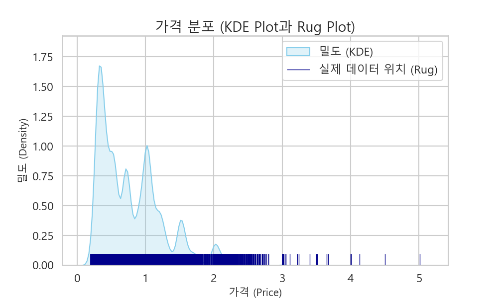
# 17-2 Rug Plot + kde Plot
plt.figure(figsize=(10, 6))
sns.kdeplot(data=df, x='carat', fill=True, color='skyblue', label='밀도 (KDE)')
sns.rugplot(data=df, x='carat', height=0.05, color='darkblue', label='실제 데이터 위치 (Rug)')
plt.title('캐럿 크기 분포 (KDE Plot과 Rug Plot)', fontsize=20)
plt.xlabel('캐럿 (Carat)', fontsize=15)
plt.ylabel('밀도 (Density)', fontsize=15)
plt.legend()
plt.savefig(os.path.join(folder_name, '17_rugplot_carat_with_kde.png')) # 파일 이름도 변경
plt.show(block=True)

df.info()

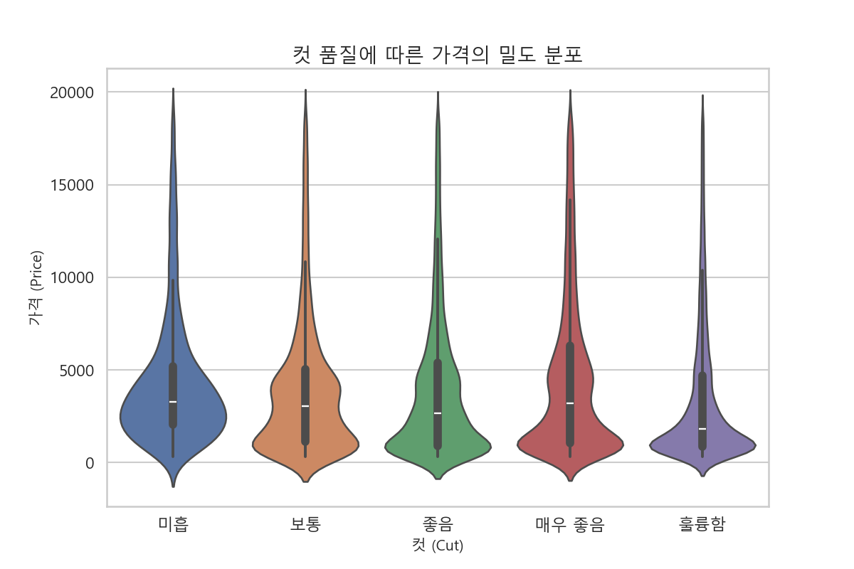
# 18. Violin Plot (바이올린 플롯)
plt.figure(figsize=(10, 6))
sns.violinplot(x='컷팅', y='price', data=df, order=cut_order, palette=palette_deep)
plt.title('컷 품질에 따른 가격의 분포 (Violin Plot)', fontsize=20)
plt.xlabel('컷 (Cut)', fontsize=15)
plt.ylabel('가격 (Price)', fontsize=15)
plt.savefig(os.path.join(folder_name, '18_violinplot.png'))
plt.show(block=True)

# 19. Interactive Plot (인터랙티브 플롯) - Plotly
fig = px.scatter(df.sample(1000, random_state=42), x="carat", y="price", color="컷팅", size='depth', hover_data=['clarity', '색상'], title='캐럿과 가격의 인터랙티브 관계', color_discrete_map=palette_deep_dict)
fig.write_html(os.path.join(folder_name, "19_interactive_scatter_plot.html"))


# pair plot
plot = sns.pairplot(df,
                    vars=['price', 'carat', 'depth', 'table'],
                    hue='컷팅',
                    palette='bright', # 색상 팔레트 지정
                    markers=["o", "s", "D", "P", "X"]) # 컷 등급별로 마커 모양 다르게 지정

plot.fig.suptitle('\nDiamond Price by Carat, Depth, Table (Grouped by Cut)', y=1.02)
plt.show(block=True)


# rel plot
plot = sns.relplot(
    data=df,
    x='carat',
    y='price',
    hue='컷팅',
    size='depth',
    style='색상',
    col='clarity',
    col_wrap=4, # 한 줄에 최대 4개의 그래프를 그림
    palette='bright',
    height=4 # 각 하위 그래프의 높이 지정
)
plot.fig.suptitle('\nCarat vs Price by various Diamond Features', y=1.03)
plt.show(block=True)

# lm plot
plot = sns.lmplot(
    data=df,
    x='carat',
    y='price',
    hue='컷팅',
    col='색상',
    col_wrap=4,  # 한 줄에 최대 4개의 그래프를 그림
    height=4,    # 각 하위 그래프의 높이
    palette='bright',
    scatter_kws={'alpha': 0.4, 's': 20},
    line_kws={'linewidth': 2}
)
plot.fig.suptitle('\nCarat vs Price by Cut and Color', y=1.03)
plt.show(block=True)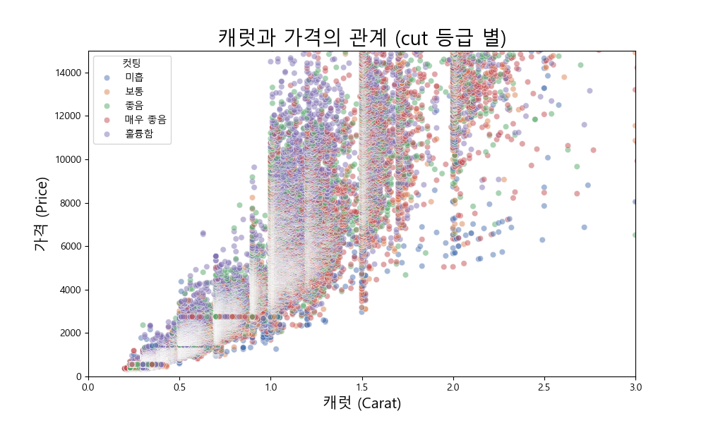

 9_3d_scatter_plot.html
4.61MB
9_3d_scatter_plot.html
4.61MB
 19_interactive_scatter_plot.html
4.62MB
19_interactive_scatter_plot.html
4.62MB
'팀과제' 카테고리의 다른 글
| Machine learning & Deep learning # ppt & pdf (0) | 2025.08.22 |
|---|---|
| Machine learning & Deep learning # 3 (0) | 2025.08.22 |
| Machine learning & Deep learning # 2 (0) | 2025.08.22 |
| Machine learning & Deep learning # 1 (1) | 2025.08.22 |
| 빅 데이터 전 처리 100문제 (2) | 2025.08.22 |